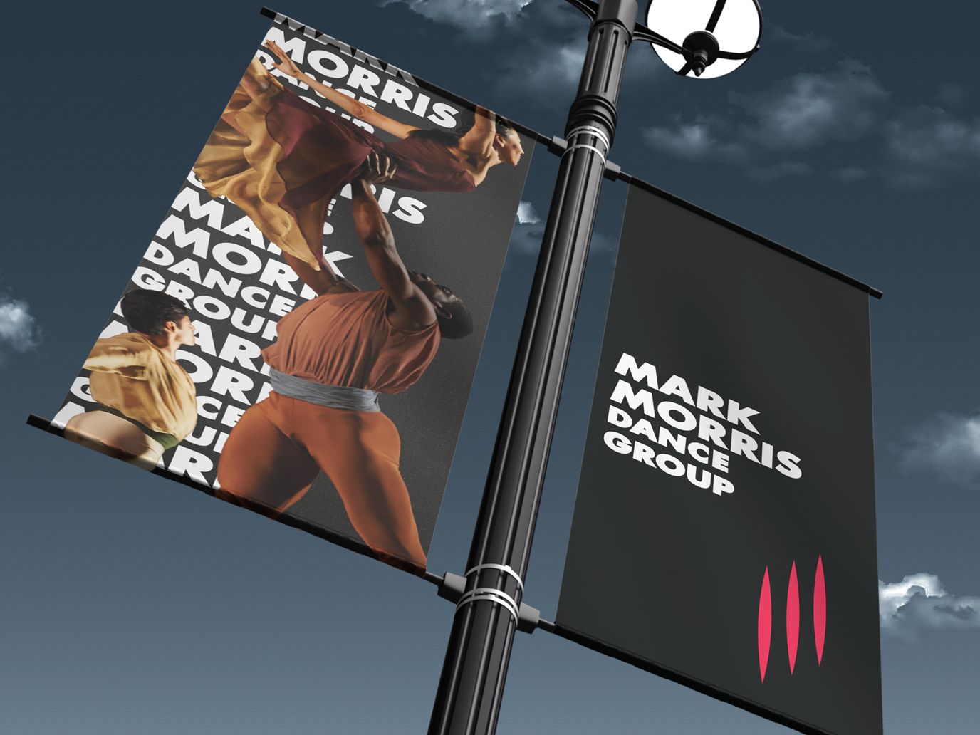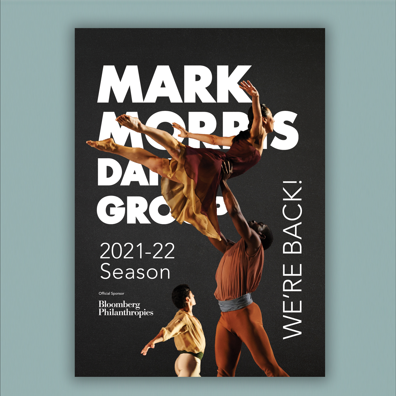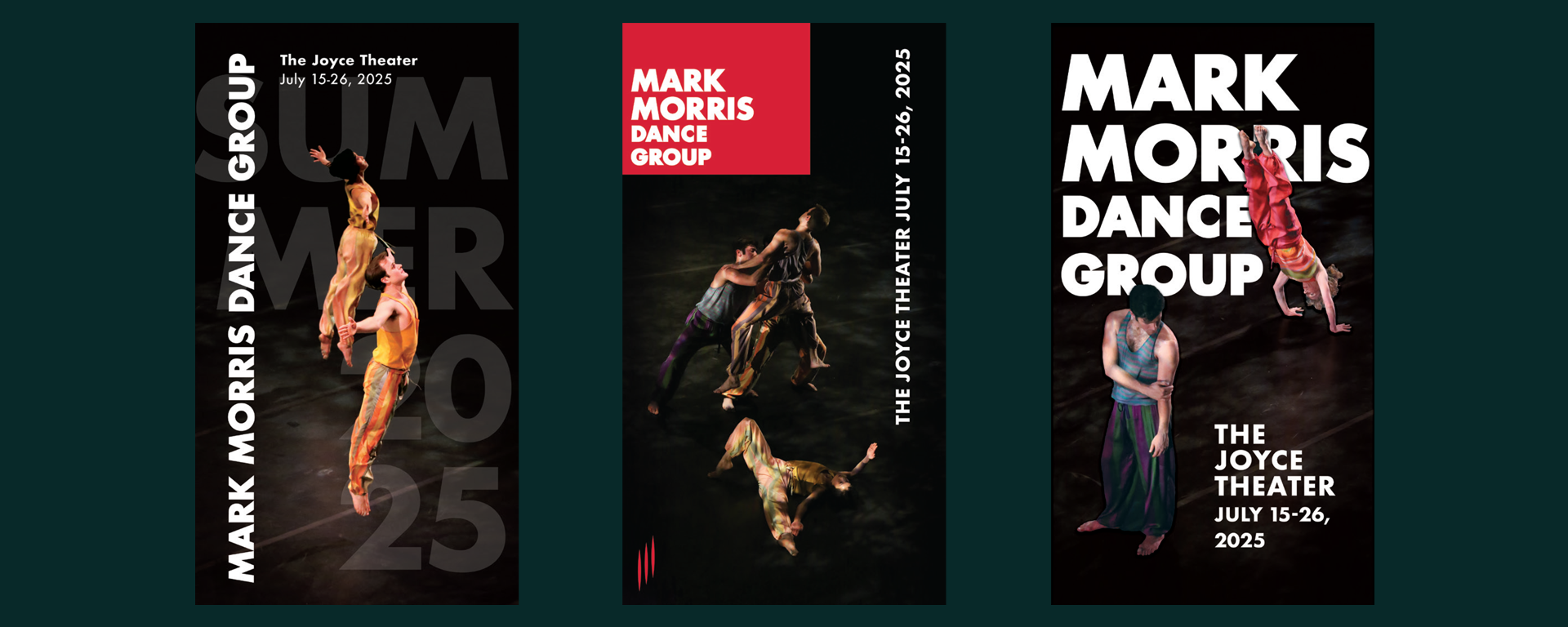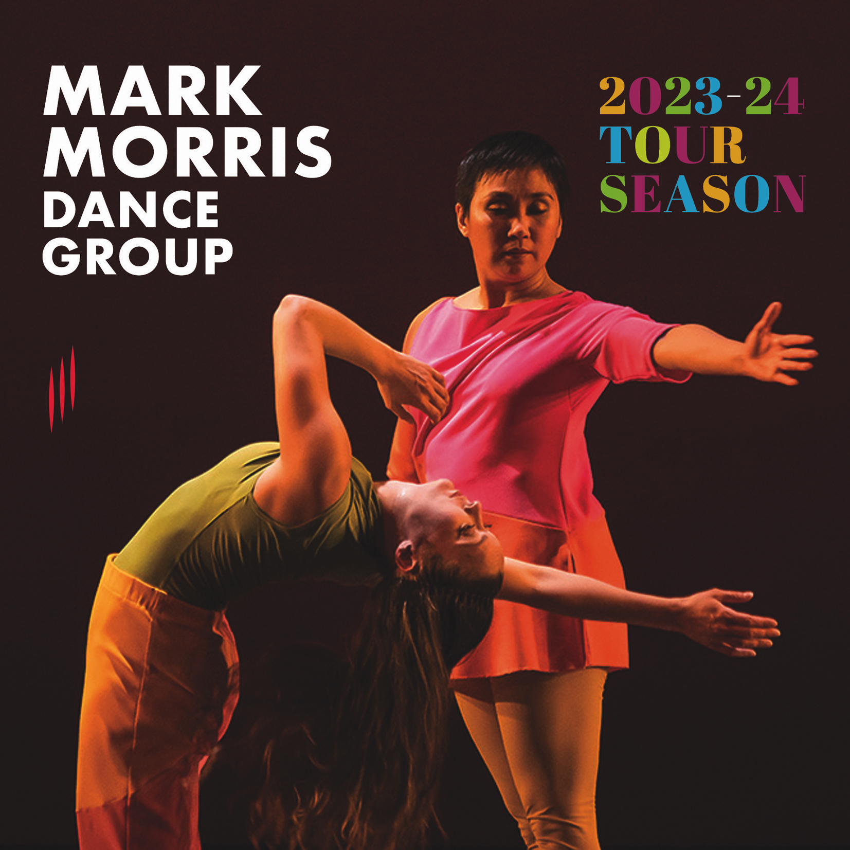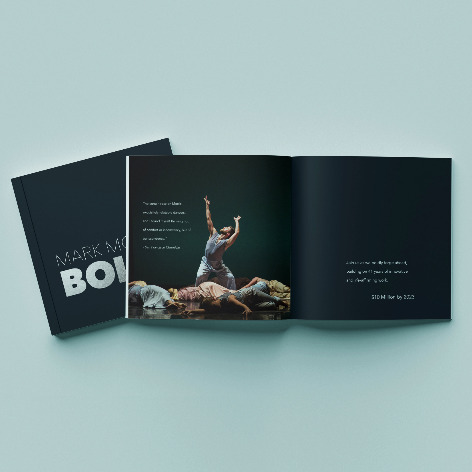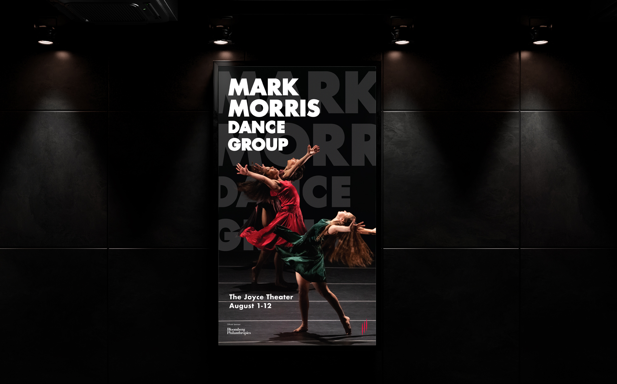
MMDG had a brand look in place along with an amazing photo library when E7 first called arriving. We were tasked to take their existing materials and reinvent how their system looked when used posters, ads, signage and various collateral materials.
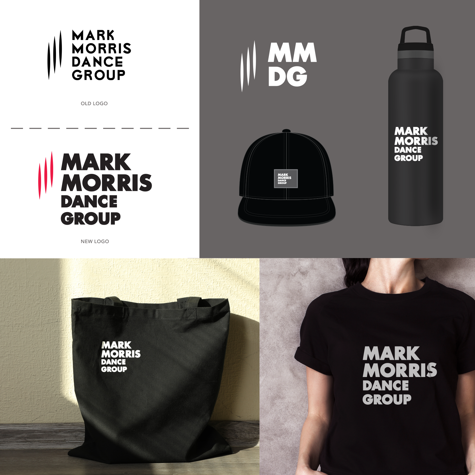
Not only did I help redefine the look and feel of MMDG print and (some) digital projects, I also redesigned the Group's logo itself going away from their cool but slightly quirky vibe to a stronger, more iconic wordmark that is partnered with their 3 stroke icon. I also created a suite of materials using the client's beautiful photography while following very specific image usage guidelines.